Typeface Tuesday
Here’s another pointer tutorial for you today! This one deals with your fonts and putting them on a layout, whether you use them to journal or for titles. When you write on actual paper with an actual pencil or pen – even using brushes – what you are writing/painting takes on the texture of the paper you are writing/painting on. Here’s how to get your digital text to realistically take on the texture of your paper. I’m using a cardboard paper and Dazzle Unicase to demo 🙂 Images can be clicked to open a larger version so you can see better!
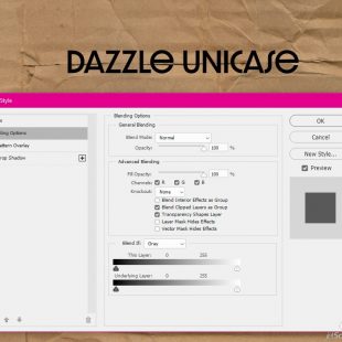
Once you have your text on the page, right click on the text layer and click on Blending Options
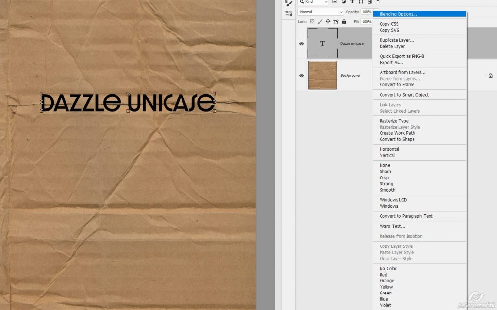
This is what you should be seeing now
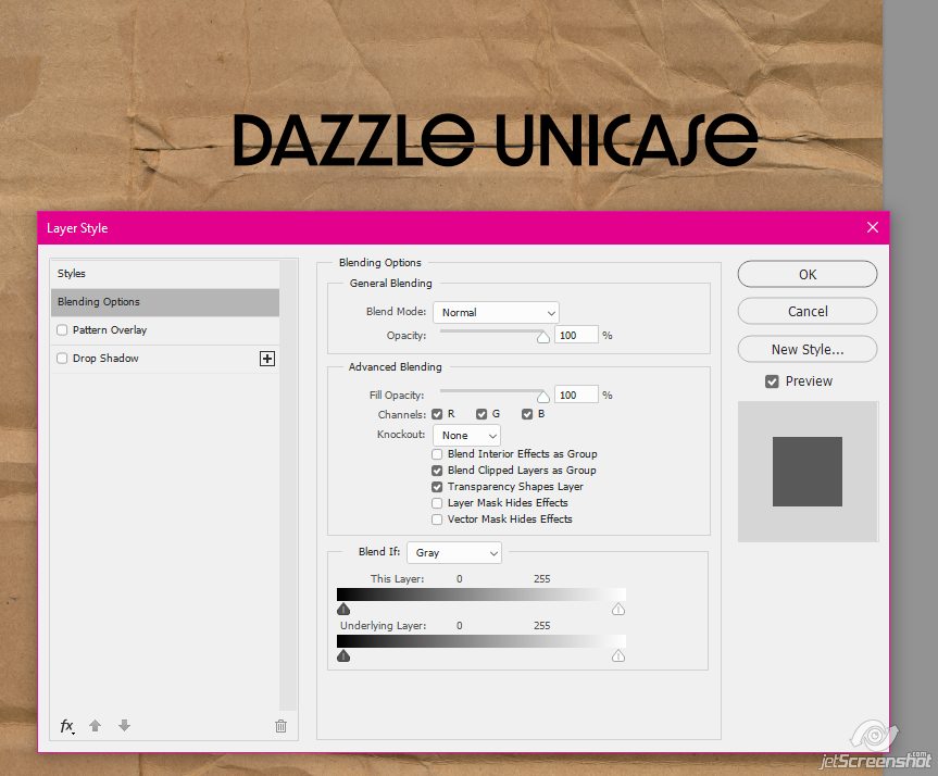
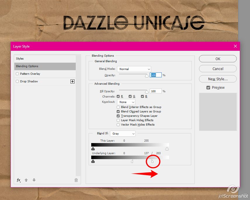
At the very bottom of the box, move the white pointer/slider to the left until your text starts disappearing on the page
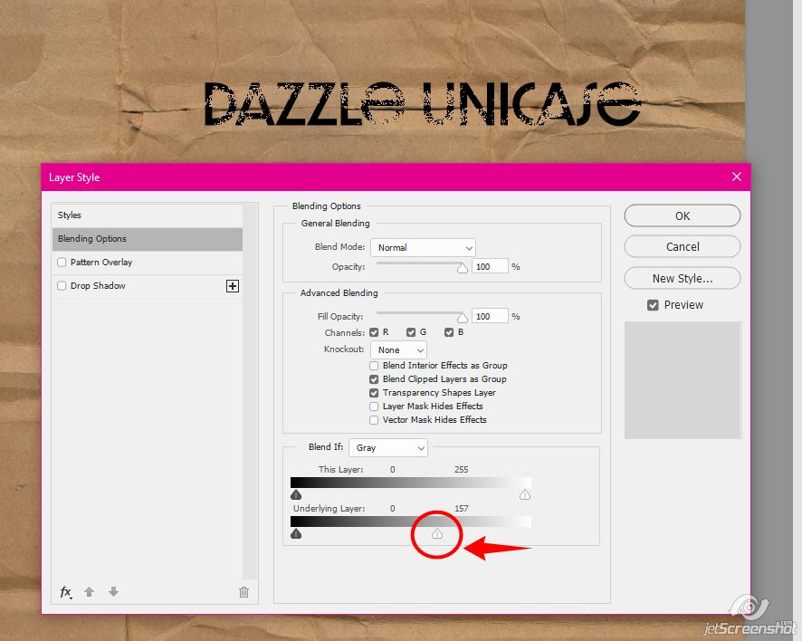
With the ALT button pushed down, give the pointer/slider a click, it will split down the middle:
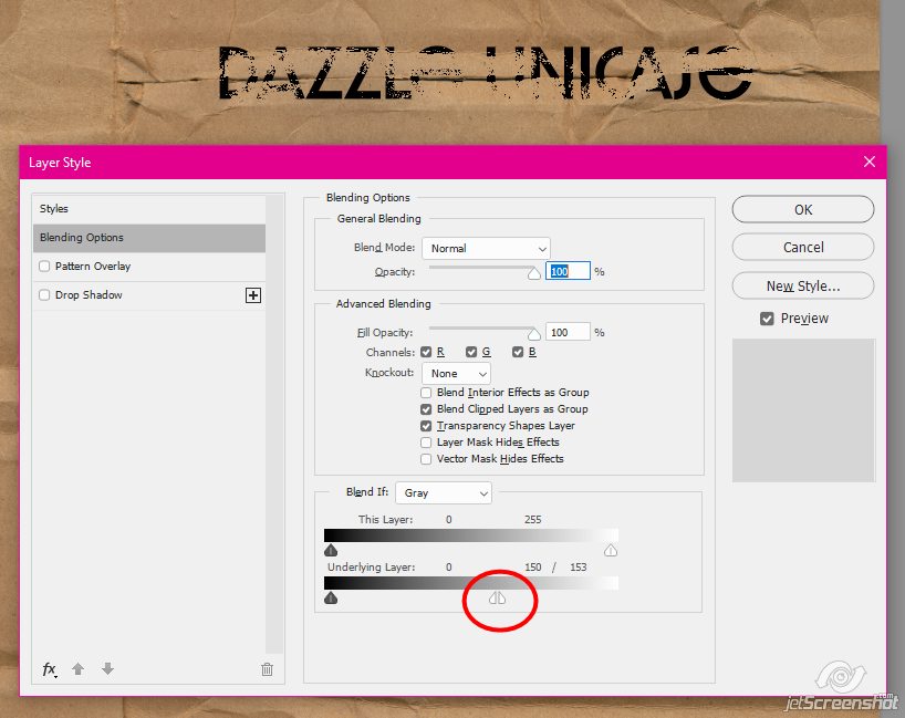
Move the right half of the slider back to the right until you’ve filled your text back in
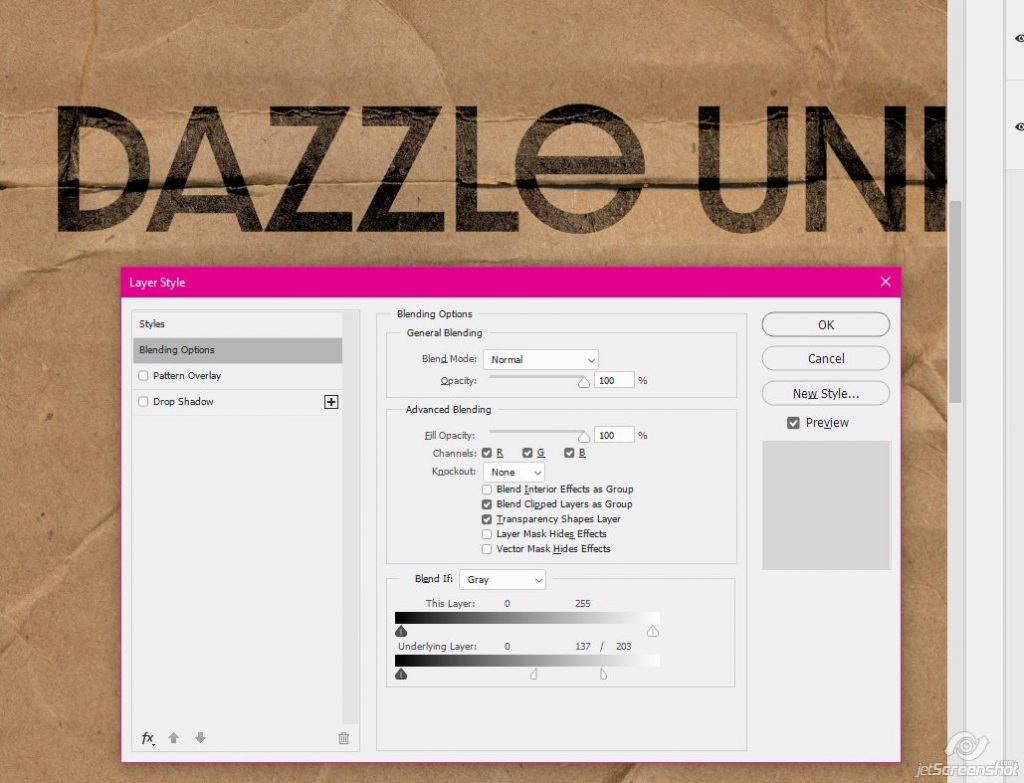
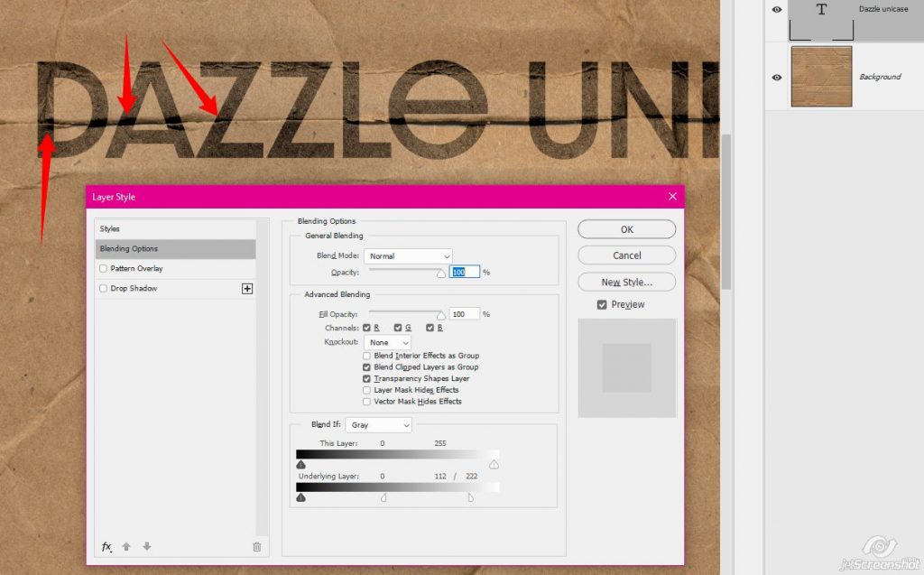
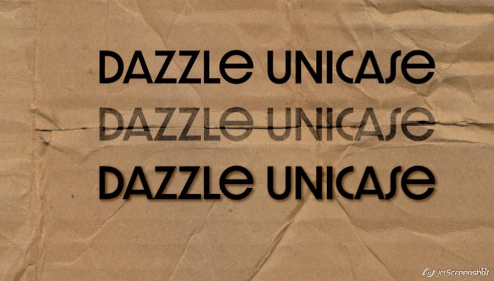
Here’s a look at it up close – see how some of the cardboard texture (and the wrinkles!) are showing through the text now?
Here’s a look at the text comparisons. The top text I’ve done nothing to. The middle text where I manipulated the blending modes. And the bottom text just has a small drop shadow. I don’t know why you would drop shadow your journaling, you can’t do it in real life?
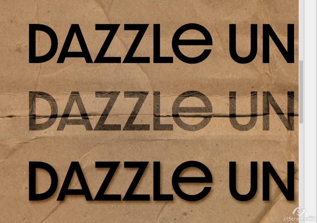
The text with manipulated blending modes looks SO much more realistic!
How do you blend your text into your pages? I’m always on the lookout for different ways to do things!
PiCKLEBERRYPOP » Tipster Tuesday: What Not to Do #2 said...
on June 11th, 2019 at 12:02 am
[…] look quite right. So instead of shadowing your paint, change the blend mode. You can use this method to make it look like it’s soaked in to the paper (it’s not just a good method for […]
PiCKLEBERRYPOP » Tutorial Tuesday: Blending Papers said...
on December 17th, 2019 at 3:01 am
[…] Method one is a little bit easier, can be a little bit cleaner, and works exactly like creating Realistic Typeface on your layout. Method two is more customizable in that it uses brushes, so the results are widely […]