Tutorial Tuesday – Offset Titles
As you might know, I love creating word art. I love the impact it can have on a layout. But, as a designer, I realize that sometimes the collection you’re working with doesn’t have just the right title, or you want to personalize it a bit. So, today I’m going to show you a super easy way to create a title that can give your page a little punch. I always create my word art in Illustrator, but today, I’m going to show you a fun and easy technique using Photoshop. It’s a simple offset technique that takes a plain font and gives it a little personality.
We all know that there are a lot of ways to create the same effect. I’m just explaining one way today 🙂 I have included screenshots from Photoshop, but have also included instructions for this technique PSE! So, follow the steps below for each part of your title:
- First of all, choose your font and type out your title. I’m using the font, IMPACT. Make sure you use a large font size. We all know it’s easier to scale down than up 😛 I typed each word on a separate layer. That makes customization a little easier.
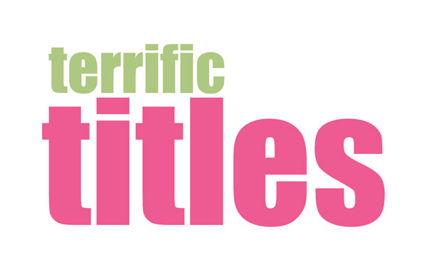
- When you’re satisfied with your title, duplicate each layer (CTRL J or CMD J on a Mac).
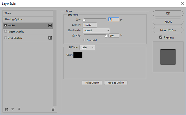
- In your layers Palette, select the TOP LAYER of one of the words in your title. I’m going to work with the word terrific first. Click on fx > stroke in the layers palette. (You can also go to the top menu bar and select Layer > Layer Style > Stroke.) Set the stroke size to 3, Position: Inside, Blend Mode: Normal, Opacity 100% and Color Black. For PSE you would choose Layer > Layer Style > Style Settings with the same settings for your stroke)
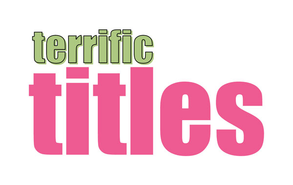
- Now your image will look like you have a simple, outlined/stroked word on your layout. Right now, it’s not obvious that there are two layers of the same word.

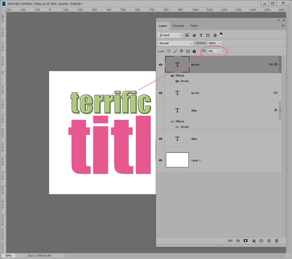
- Nudge the stroked layer up and to the left so that it’s slightly offset. Lol, and if you’d rather nudge it down and to the right, that’s fine, too! I use my arrow keys, and just moved it two or three taps 🙂 But, as you can see on the image below…it’s still not right. It just looks like a poorly shadowed image because there is still a fill on the word we nudged. We need to change one more setting.
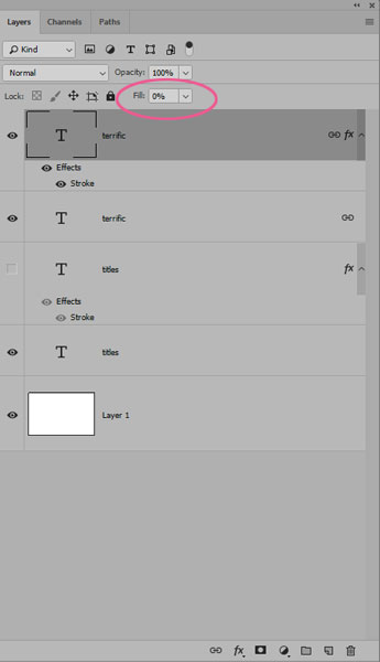
- We’re going to adjust the fill on the stroked word. So, go to your layers palette again, and change FILL to 0%. (In PSE, go to the Horizontal Type Tool and in Tool Options, open the Style Picker drop down menu and choose Visibility. Click on Hide Style.)
- …and NOW you have an offset effect to the first word in your title. **Hint** Link the two layers of your word in your layers palette so that when you try to reposition them, they move together. Lol, that saves the headache of moving them independently. Been there, done that. I always learn the hard way 😛
- Now you can go back and repeat the steps for any other words, and your title will be completely offset.
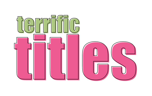
- Adjust the position of the words in your title if necessary. Once you’re happy with it, save your layered file, and then save a png file. I ALWAYS keep layered files…that way when you notice a typo a week later, you don’t have to start all over 😛
I hope you’ll play with this simple technique! It’s a fun way to personalize the titles on your layouts! Get creative and mix the fonts up. Use a script font for one of the words, have them overlap…there are lots of possibilities!

Connie Sessler Miles said...
on August 13th, 2019 at 4:15 pm
Oh my goodness!! I never knew this! Thanks for a great tutorial.
Glori said...
on August 13th, 2019 at 5:14 pm
Love the way the title has a pop doing this technique! Great tut, Jen!
admin said...
on August 13th, 2019 at 5:18 pm
Lol, it’s always nice when we can share stuff that helps seasoned scrappers! I guess Jen and I need to have separate identities when we post. This one was from me…but hey, Jen could have easily done it *grin* ~ Fayette
admin said...
on August 13th, 2019 at 5:19 pm
Lol, I’m glad you learned something new, Connie! ~ Fayette
PiCKLEBERRYPOP » Thursday Threedom said...
on May 14th, 2020 at 3:01 am
[…] #1: Terrific Titles – PDF […]