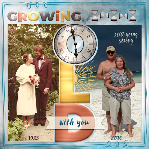
That’s a really clever visual twist — using a clock as the “O” adds so much meaning. It feels like it’s symbolizing time, memories, and the journey you’ve shared. It’s subtle but powerful, and it elevates the whole layout in a meaningful way. Beautifully done!