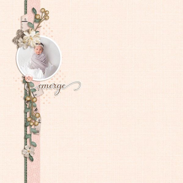
I love the use of “white space” on this layout, and the softness of it. My favorite part is the circle photo spot. It contrasts well with the straight edges of the anchor pieces. Great job.
Hi, @01lousmith! What a sweet layout! I love how you made the pink paper into a thin strip and then the green paper into almost edging for it. The green really pulls the vertical line into focus. I like your clusters and how you've used the ribbon. And I think it was creative to add a stroke to the word art to make it into a sticker.