- Joined
- Oct 16, 2008
- Messages
- 2,675
- Reaction score
- 5,854
- Points
- 611
- Location
- Perth, Western Australia
Hi, Jenni here welcoming you to the Paper Stack Challenge for July. Our lovely designers add beautiful papers to their collections and it is often hard to choose just one as your background.
For this challenge you must USE AT LEAST 3 PAPERS on top of the background paper.
These papers must not be altered in any way - no downsizing, blending two or more papers together, made into mats for photos or frames or as torn papers.
HOWEVER papers can hang off the page (as in my example) but must be clearly seen as a paper from the collection and of course stacked (meaning you are able to see clearly that there is a paper beneath the one above, not just a ribbon like slim line). Angled papers always add interest to a page - this is not a requirement though.
Additionally at least 1 photo and 1 element must be tucked between papers - these can be lace, ribbon or any element within the kit/collection you are using and can be either alone or as part of a cluster.
The title must be more interesting than just one font. Add an alpha or word strip or two different fonts.
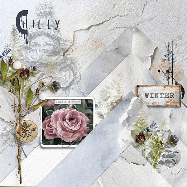
I have used 6 papers in my layout. They have not been altered but 5 hang off the page.

I created my page with A Winter Tale [collection] - a digiDUOS by Kakleidesigns and Dutch Dream Designs.

Our 2024 Challenge Rules have changed just a little. Please read:
For this challenge you must USE AT LEAST 3 PAPERS on top of the background paper.
These papers must not be altered in any way - no downsizing, blending two or more papers together, made into mats for photos or frames or as torn papers.
HOWEVER papers can hang off the page (as in my example) but must be clearly seen as a paper from the collection and of course stacked (meaning you are able to see clearly that there is a paper beneath the one above, not just a ribbon like slim line). Angled papers always add interest to a page - this is not a requirement though.
Additionally at least 1 photo and 1 element must be tucked between papers - these can be lace, ribbon or any element within the kit/collection you are using and can be either alone or as part of a cluster.
The title must be more interesting than just one font. Add an alpha or word strip or two different fonts.
I have used 6 papers in my layout. They have not been altered but 5 hang off the page.
I created my page with A Winter Tale [collection] - a digiDUOS by Kakleidesigns and Dutch Dream Designs.
Our 2024 Challenge Rules have changed just a little. Please read:
- Layouts must be created with 75% current PBP Designers’ Products. You may use product from any of our active designers. Check designer challenges to see if they offer additional prizes for using their designs exclusively.)
- You may use retired product if it was retired from PBP in the last three months. The retired product can only account for the 25% “non-current” PBP Designs.
- Upload your layouts to the PBP Gallery (be sure to select PBP Team Challenges as one of the additional categories that you add your layout to.
- Link your layout in this thread to your gallery layout
Make a post in this month’s tracking thread for all of your challenges.
Add the gallery link for your layout from this challenge to your tracking post. (Please do not add images to the tracking thread.) That way we’ll be able to easily see who has earned the monthly prize....and speaking of that!
MONTHLY CHALLENGE PRiZE
We think you’re going to LOVE the prize we’re offering this year for participating in our challenges.
Complete all of this month’s CT and Designer Challenges according to the outline set by the host, and you’ll receive a GOODiE BAG of PRiZES from the PBP Design Team! The Goodie Bag may include coupon codes for $ off or % off from individual designer’s shops or NEW freebies created for our challenge prizes!
So, make sure you complete all of the challenges that are pinned to the top of the forum each month & keep your post in the tracking thread updated! Only those who complete ALL of the challenges will receive the Goodie Bag.
Goodie Bags will be sent out by Private Message by the 5th of each month.
We hope you’ll play along with us!
Last edited:


