Tipster Tuesday – What NOT to Do #3

Jen posted a great “What Not To Do” Tip a few weeks ago about not stretching or “squishing” photos to fit a frame. You can see that tip here. I’d like to follow that up today with a similar tip.
Designers go to great lengths to create designs that in the right proportions and easy for the end user to place on a layout. Of course, we can’t always guess what size you need an element in, or what ratio you need a frame in. So, we almost always design on the big side, so that you can easily scale them down. The problem arises when you scale an element, but don’t scale it uniformly – so you stretch or reduce it more vertically than horizontally (or vice versa.) Here’s a sample:
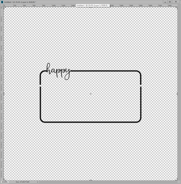
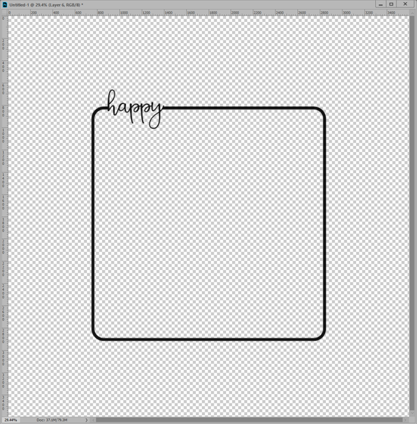
This is a frame from from my Sunny Disposition Collection. This frame is thin, simple and really fun to use as an accent for a great photo
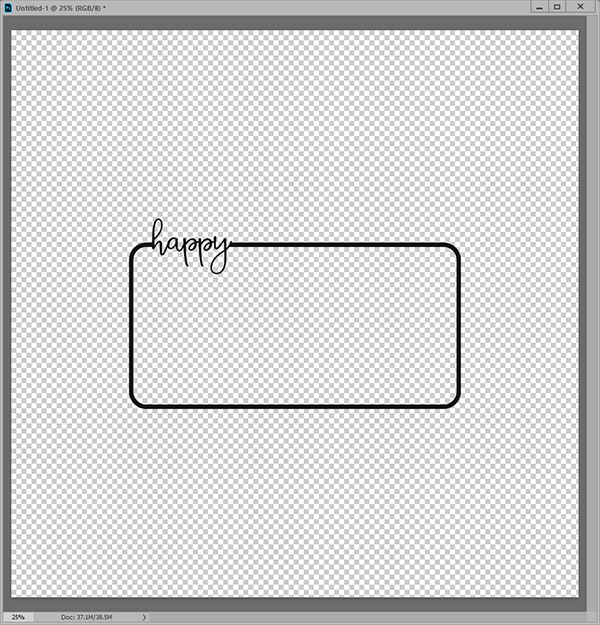
But, what if I want to use this frame on a square photo….should I scale it down horizontally, or enlarge it vertically? *shudder*
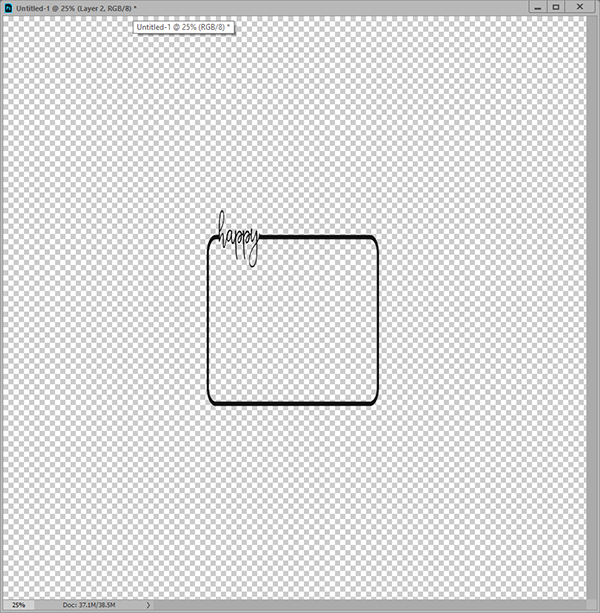
The image below shows the frame after it has been scaled down horizontally to create a square photo space. Not only does it make the border on the frame uneven, it also throws off the rounded corners, and makes the font look totally wonky. It makes my eyes bleed *grin*
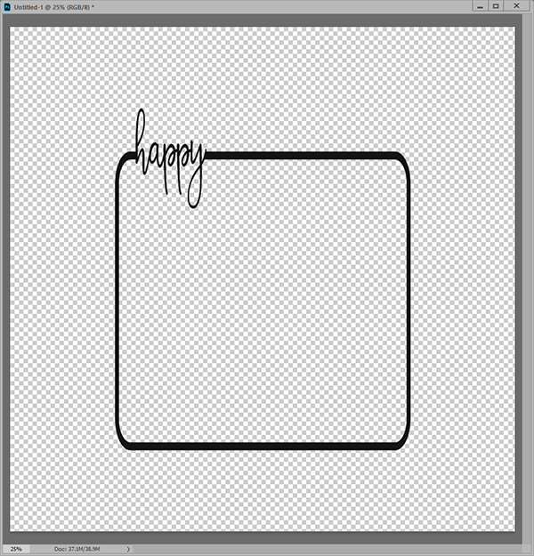
The frame below has been scaled/stretched vertically to create a square photo space. This has the same effect – it makes the top and bottom borders visibly thicker than the sides. The rounded corners are no longer nicely round, and well, the font looks a little too lanky 🙂 Yup, it’s messing with my eyes again!
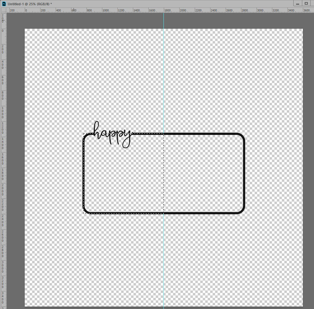
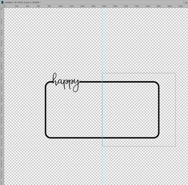
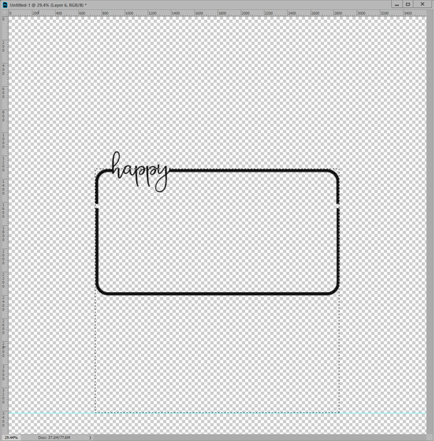
Here’s a better option. If you want to scale the frame down, rather than actually using the transform/scale tool, try this little trick. While holding the shift key down, use the marquee tool to create a square selection, approximately the size you’d like to scale the frame down to. Drag a guide so that it lines up with the right side of the marquee (to drag a guide, just click CMD or CTRL R to show Rulers on the edges of your document and then drag your pointer tool from the ruler to the edge of the selection on your document.) See image below:
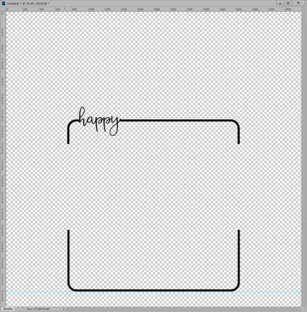
Once you have your guide, use the marquee tool again to draw a new square selection around the right side of your frame. Make sure you include the entire right side beyond the guide in your selection. (You can also invert your original selection, but then you’ll have to remove the lettering from your selection.) So, I’m simplifying the steps for you 🙂
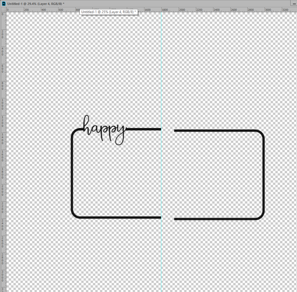
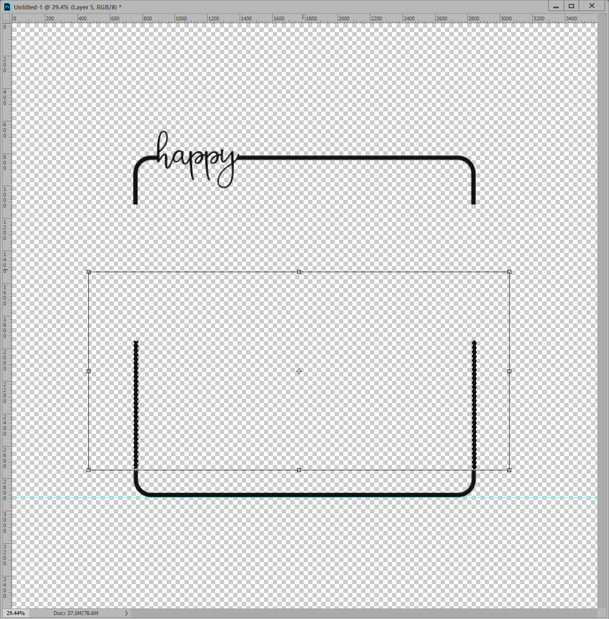
Now, just copy (CTRL/CMD C), delete and paste (CTRL/CMD V). You’ll end up with something that looks like this. Lol, I intentionally let it be out of alignment so you could really see the break between the two sides.
Now it’s just a matter of aligning and moving the right side of the frame to create your square frame. As you can see below, I’ve just dragged the right side over the left side of the frame to create my square photo opening. Just align the right side of the frame with the guide…easy peasy!
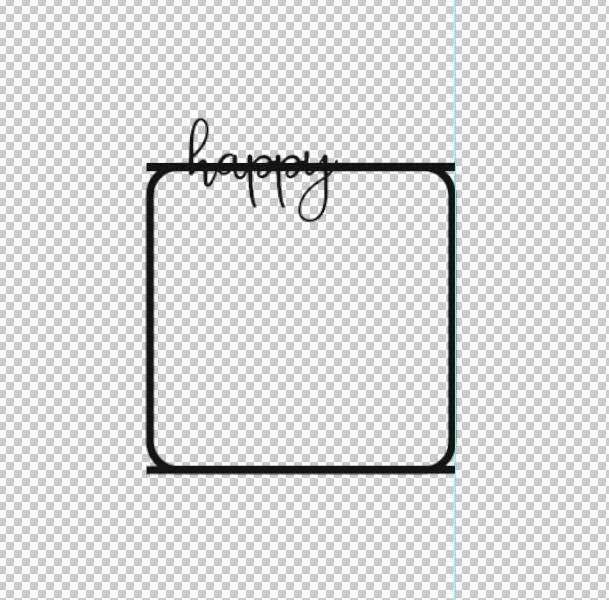
Once you have it moved into place, you’ll just need to mask or erase the parts of the frame that you don’t want to see. You can either use the marquee/selection tool to help you do that precisely, or just zoom in and use your eraser or masking tool. (For this simple frame, I just erased, but I usually use a layer mask…just in case I screw up. Yes, that has happened once…maybe twice *grin*).
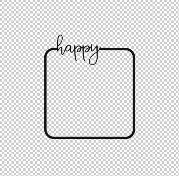
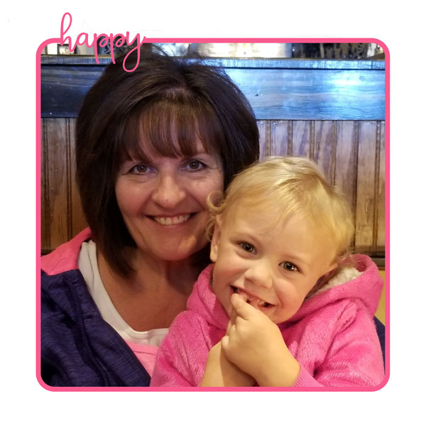
Once you’re satisfied with frame, merge your layers, and VOILA…you have a square frame with NO wonky borders, letters or corners. Now, doesn’t this look a LOT better than the scaled version?
You can use a similar technique to scale the frame UP instead of down. I started with the same frame that I showed in the first image above. But, this time, I changed the steps a bit.
First, you’ll need to use your marquee tool to draw a rectangle around the top part of your frame. Make sure you include all of the lettering and partway down the side so that the entire rounded corner will be on this layer. Then, copy, delete and paste the top section onto a new layer. The top section is now separate from the lower part of the frame, so now I can start moving things to create a square
Use your marquee tool to create another square. Hold down your shift key and drag from the top left corner of your frame to the bottom right. Now, drag a guide down from the top ruler bar on your document window, and line the guide up with the bottom edge of your selection.
Next, drag the bottom section of the frame down so that it lines up with your guide.
Now, draw another selection box with your marquee tool, ONLY around the straight sides of the lower section of the frame. NOW, we’re going to transform/scale the sides of the lower part of the frame so that they meet the top of the frame. So, click CTRL/CMD T to transform, and begin dragging the selection up until the sides meet the top portion of the frame.
Once the sections of your frame meet, apply the transformation, make sure they’re aligned vertically and merge the layers…and again, you have a perfectly proportioned, symmetrical frame that is twice as tall as the original design was!
So, do yourself a favor and try this friendly transform technique. You’ll be happy that you did! See how happy my granddaughter and I look in the photo? Lol, I’m sure we’d be frowning in the scaled frames 😛
This technique works best on simple frames without a lot of detail or texture. However, I’ve used it on a rectangle wooden frame, as well as lightly textured frames with success. You just have to use the clone and healing tools to cover up the area where the edited portions of the frame meet. That’s a tip for another day 🙂
Now that I’ve pointed this issue out to you, I’ll bet you notice a LOT of layouts that just transform the frames and live with the wonkiness. If that doesn’t bother you, that’s okay, and I won’t make you change your layouts. Lol, this is just another, more precise way to make your layouts look a little more polished. Enjoy!
Kimberly Behrig said...
on July 30th, 2019 at 6:57 am
Thanks for the tip! I know and you’ve probably seen that I’ve done this wonkiness ? Now I can try this and not have this problem. I’ve not used frames for this reason…plus I recently learned how to use clipping masks and fell in love with that technique! I love learning more techniques in PSE. Your granddaughter is adorable!!
admin said...
on July 30th, 2019 at 9:22 am
Lol, I’m glad that you will be able to use this tip 🙂 I hadn’t noticed that you’d scaled them with wonkiness *grin* I’ll be watching and hope it works well for you. That little granddaughter is full of fun and sass. Thanks for your kind words! ~ Fayette
Nancy Smeltzer said...
on February 21st, 2020 at 9:21 pm
What? No more hours of fun-filled snip-clip, almost get the frames right, and then give up in frustration and cover up the awkward parts with flowers? Where’s the sport in that? Seriously, thanks for this great tip, although you have a higher sense of wonkiness than I might have. Must be that straight edge thing…:)